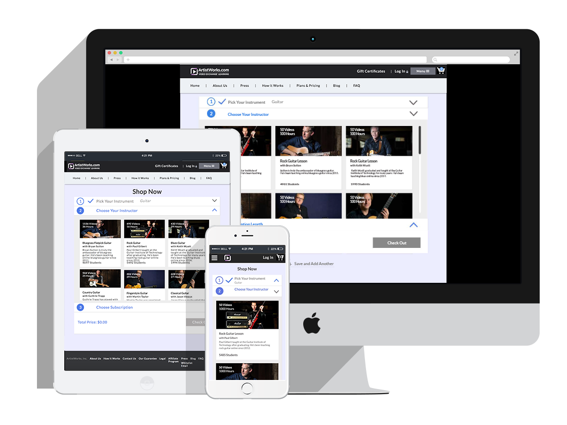
Artistworks.com is an interactive instrument learning platform learning that allows students to watch, submit and exchange videos with their instructors. The project required that I work closely with the marketing team to redesign their Join Page to boost customer conversion rate. Work performed for this project include Competitor’s Analysis, Empathy Map, User Journey, User Testing, User Flow, User Scenario, Wireframe, and prototyping.
Visit live link


We conduct competitor’s analysis on 7 different competitors and looked that what makes them better and worse and drew inspirations from 8 most popular subscription based shopping site on the market and assessed their check out system, including Lynda.com, udemy.com and tinkercrates.com. We realized that most of the check out system contains a progression bar notifying the user the next step that comes up.
Prior to sketching out our first concept, we conducted a user survey to gauge user’s decision factor when they make a selection. We found out that number of hours, reviews, number of students, and description of the class are important when they choose an instructor.
User SurveyWe also collected some feedbacks on the existing design, I posed questions such as: what can be improved, what they are hoping to see on the page and expectations when they click thru the check out system. From the feedbacks collected, I put together an Empathy Map and User Journey Matrix.
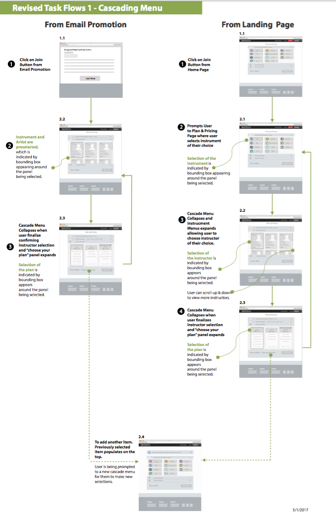
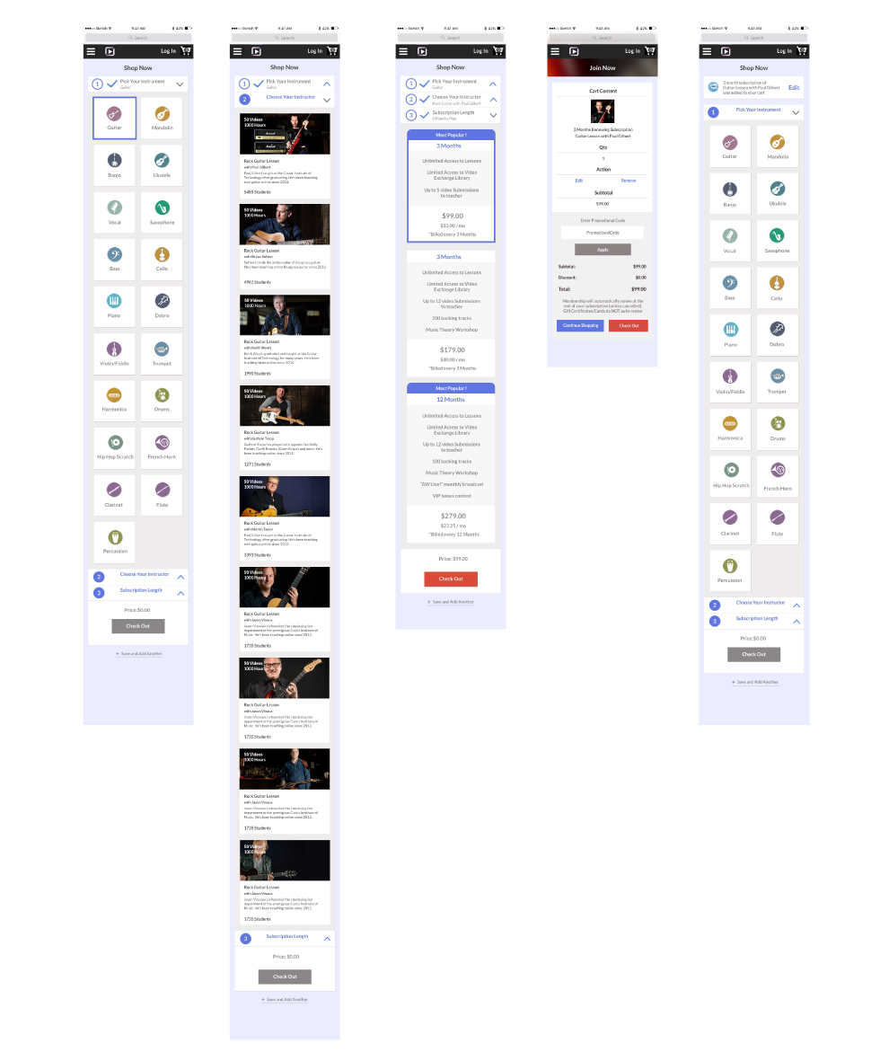
Empathy Map User JourneyI presented two wireframes of what our check out process should look like with both following the similar concept of showing clearly defined steps, but with first wireframe single page cascading menu, the second wireframe is divided up into three different pages showing progressing bar on the top. For both, we broke the selection process down to three different steps guiding the user to first make a selection for instrument, then instructor, then lastly plans.
Wireframe ProposalWe eventually decided on cascading menu presented on single page to minimize users’ need of having to scroll from one page to another. This way when user make selections, they can just glance everything on one page.
We prototyped the wireframe mock up in inVision and a launched a focus group interview assessing the new design. We conducted in person interview on 11 participants and video typed their responses. The plan was read to the user prior to testing. User Testing Plan The user’s feedback included that the categories on the first cascading menu was unclear and it’s not subcategorized enough for them to pick an instrument.
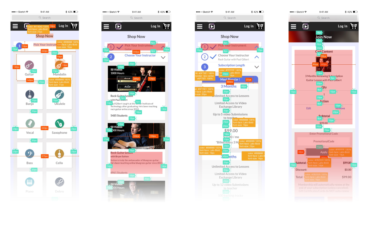
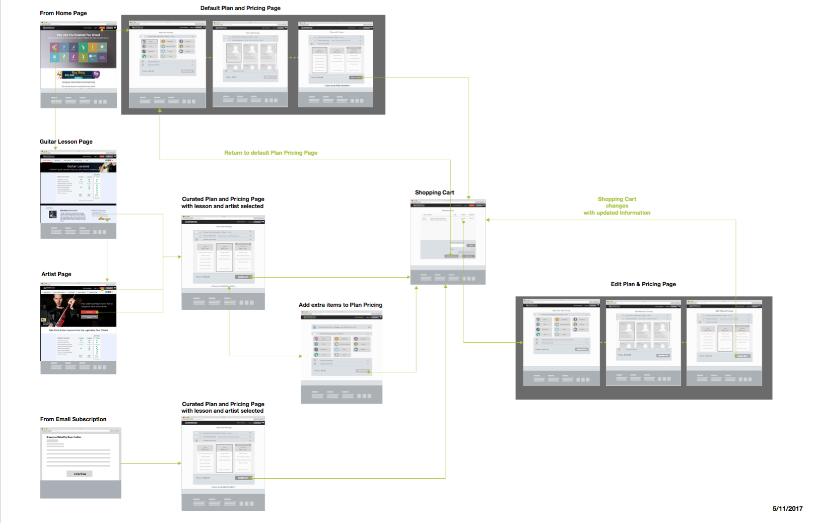
Task FlowsThe original design lists category base on the menus on the home page. We made improvements by listing out 19 categories and added iconography to improve readability. We sent a revised wireframe and scenario back out to 212 user who agree to participant in testing and received feedbacks from 40 respondents.
User Scenarios